
Assetico
A wealth management platform for mobile and desktop that turns complex financial data into a calm, precise experience for people managing their own wealth.
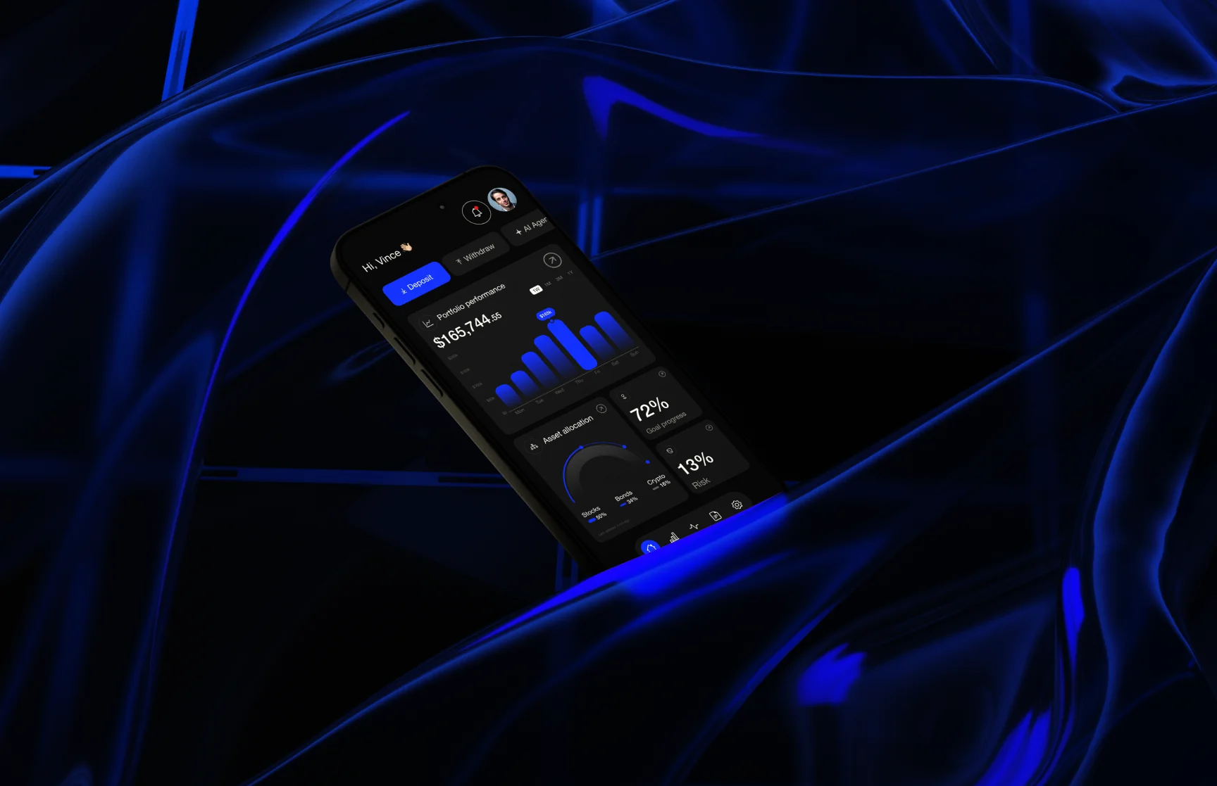
Financial clarity shouldn't be a privilege reserved for institutions.
Assetico is a wealth management platform for people who want a clear view of what they own. The brief was a desktop and mobile product that treats personal asset management as something powerful, intelligent and deeply personal.
We treated it as more than interface design. The aim was a product that behaves the way good financial advice should: calm, precise and completely on the user's side, on every screen.
Clear visibility
The essentials surface immediately; detail stays available without competing for attention.
Quiet confidence
A calm interface that earns trust by showing less, not more.
Full control
Deposit, withdraw and an AI Agent sit at the top of the dashboard, always within reach.
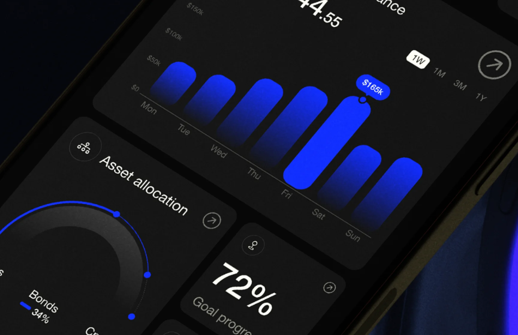
Wealth tools built for banks, not for the people using them.
The existing landscape of wealth management tools is fragmented, overcomplicated and visually dated. Most products serve the institution first and the individual second, even when that individual is simply trying to understand their portfolio at 9am on a Tuesday.
Assetico had to earn trust at first glance and present complex financial data without overwhelming anyone. It also needed one visual language across mobile and desktop, and a clear position as the modern alternative to legacy private banking tools.
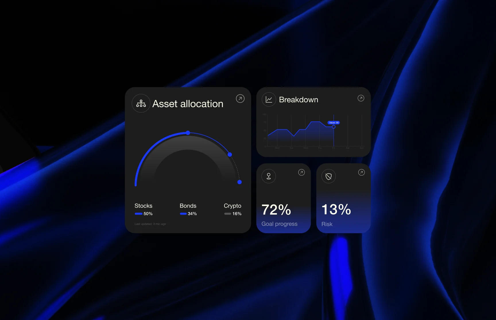
An experience that feels like the app already knows what you need to see.
Not every data point at once. What matters most, first.
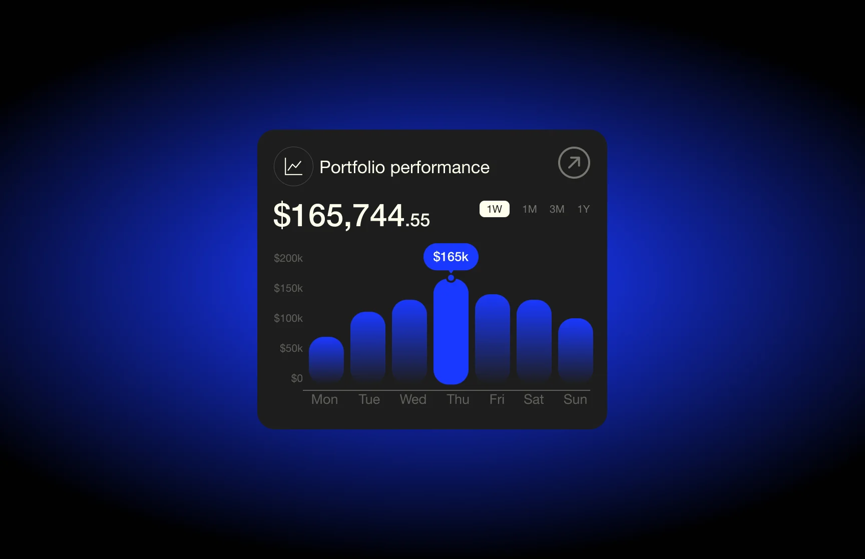
The strategy rested on three pillars: visibility, confidence and control. Rather than exposing every data point, the dashboard leads with portfolio value, allocation, goal progress and risk score, so the essentials are readable in seconds from a single home screen.
Charts were drawn from scratch rather than borrowed from a charting library: rounded bars, arc-dial allocation widgets and clean line graphs. An electric blue glow on deep charcoal creates focus, and one component system scales from iPhone to workstation without compromise.
An identity built on precision and contrast.
A bold geometric logomark, constructed on a strict grid from radial arrow forms, signals convergence, control and forward motion. It holds its clarity at every scale, from the app icon on a home screen to the splash screen.
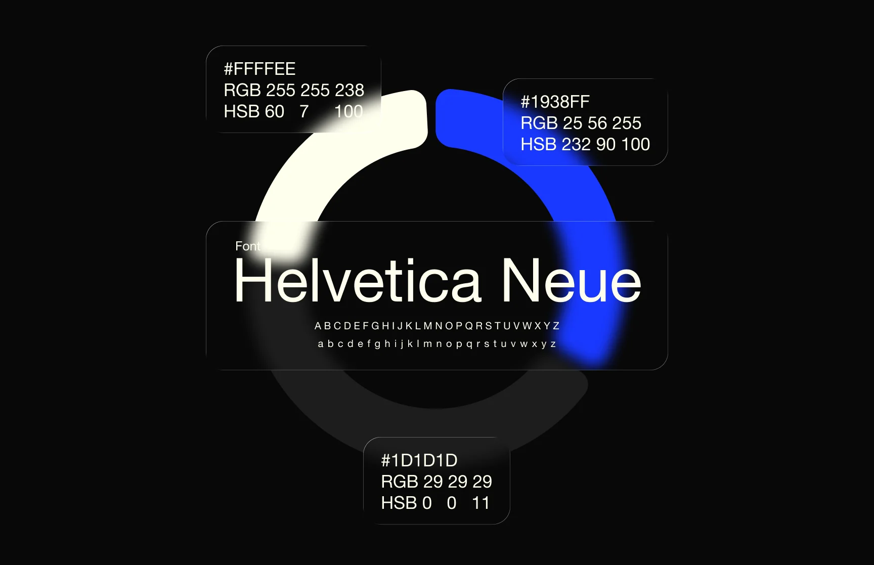
Helvetica Neue carries the typographic weight of the system: authoritative, timeless and free of decorative noise. A three-color palette of electric blue, near-black and warm cream sets a hierarchy that feels technical and premium at once, proof that serious finance can also be beautiful.
Less noise.
More signal.
Competence through restraint.
A product and brand system built to scale.
The result is a cohesive product and brand system that positions Assetico as a modern standard for personal wealth management. Rigorous information architecture and a premium visual language work together to communicate trust, intelligence and control.
Just as important, the foundation is ready for what comes next. The component system and visual language are built to extend across new asset classes, user tiers and future platform features without losing coherence.
Building something like Assetico?
Tell us what you're building and we'll come back with a clear scope, a timeline and the right team for it.
Prefer to talk? WhatsApp +971 50 262 0941