
KYRO Hydration
A premium functional sparkling water, built as a system of four states, for people who move between the gym, the desk and the city.

Water should do more. Not more sugar, more purpose.
KYRO is a next-generation hydration brand. The goal was a functional sparkling water that sits where performance, design and lifestyle meet, and feels as natural in a gym as at a desk or out in the city late at night.
It was never approached as just a drink. KYRO was built as a system of states, with each can designed around how you want to feel, think and perform, rather than around a flavor.
Function first
Electrolytes, natural extracts and targeted nutrients, kept clean, effective and easy to understand.
Sold by state
FLOW, DRIVE, RESET and EDGE: each can is chosen for an outcome, not a flavor.
Built to signal
Strong type, controlled gradients and minimal copy that read instantly, even at a distance.

Overly sweet energy drinks on one side. Functionless sparkling water on the other.
The beverage market is saturated with extremes. Artificial, sugar-heavy energy drinks crowd one end of the shelf; minimal sparkling waters that do very little crowd the other. Nothing occupied the space in between. That space is where KYRO had to live.
The product had to deliver real functional benefits without sliding into the supplement category, and carry a visual identity strong enough to stand beside lifestyle brands, not just other beverages.
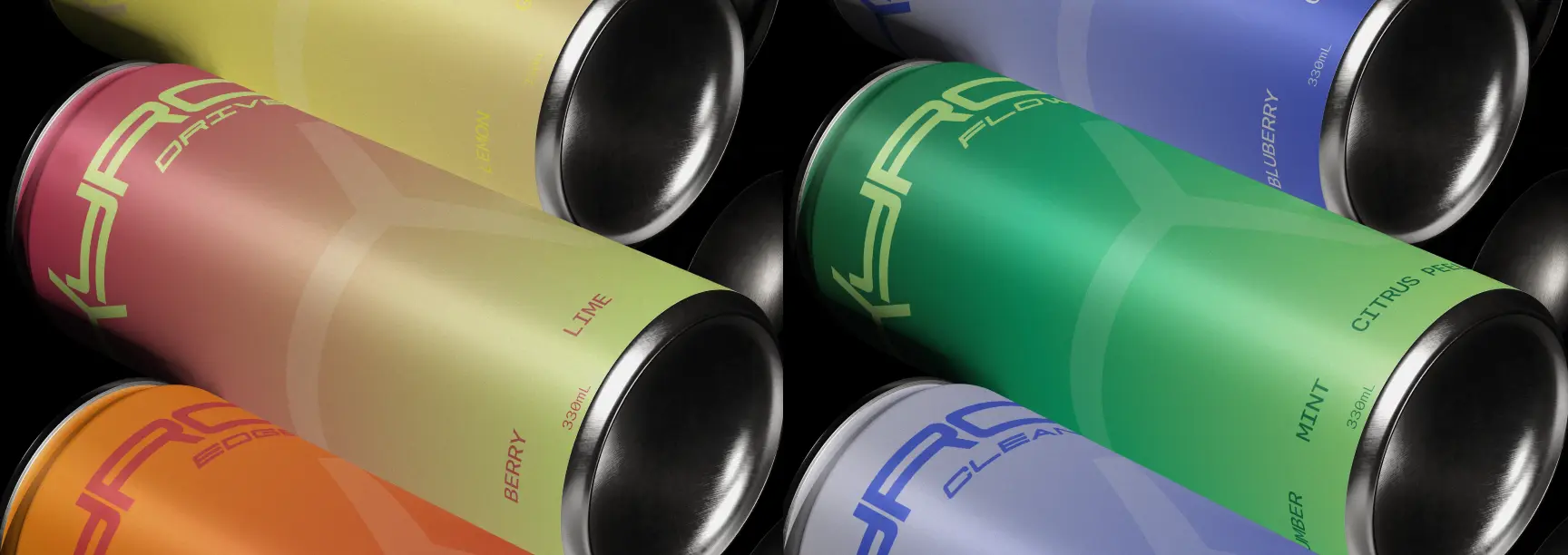
Instead of selling flavors, KYRO sells outcomes.
Built on three principles: state, simplicity and signal.
Each product is tied to a specific state rather than a taste. FLOW brings calm focus with magnesium and L-theanine; DRIVE, clean energy from natural caffeine and B vitamins; RESET, recovery with zinc and minerals; EDGE, performance with advanced electrolyte support.
Every can shares a sparkling water base, natural flavors and an electrolyte complex. Packaging stays minimal: the front says only what matters, the back gives clarity without overload. The product feels engineered, but never complicated.
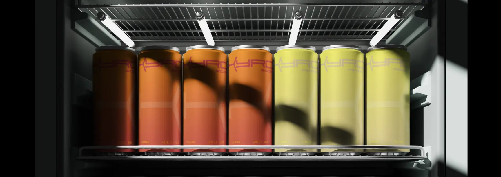
Built on contrast between calm and intensity.
A bold, condensed logotype anchors the system: confident, modern and legible across formats. Set vertically on the can, it reinforces shelf impact and creates a silhouette people recognize. Typography stays clean and assertive, with wide spacing and restrained composition.
The color system is state-driven: each variant moves through a gradient that reflects its function. The result balances two worlds, minimal Japanese-inspired clarity and high-energy performance visuals, and feels premium without relying on decoration.
Not more sugar.
Not more noise.
More purpose.
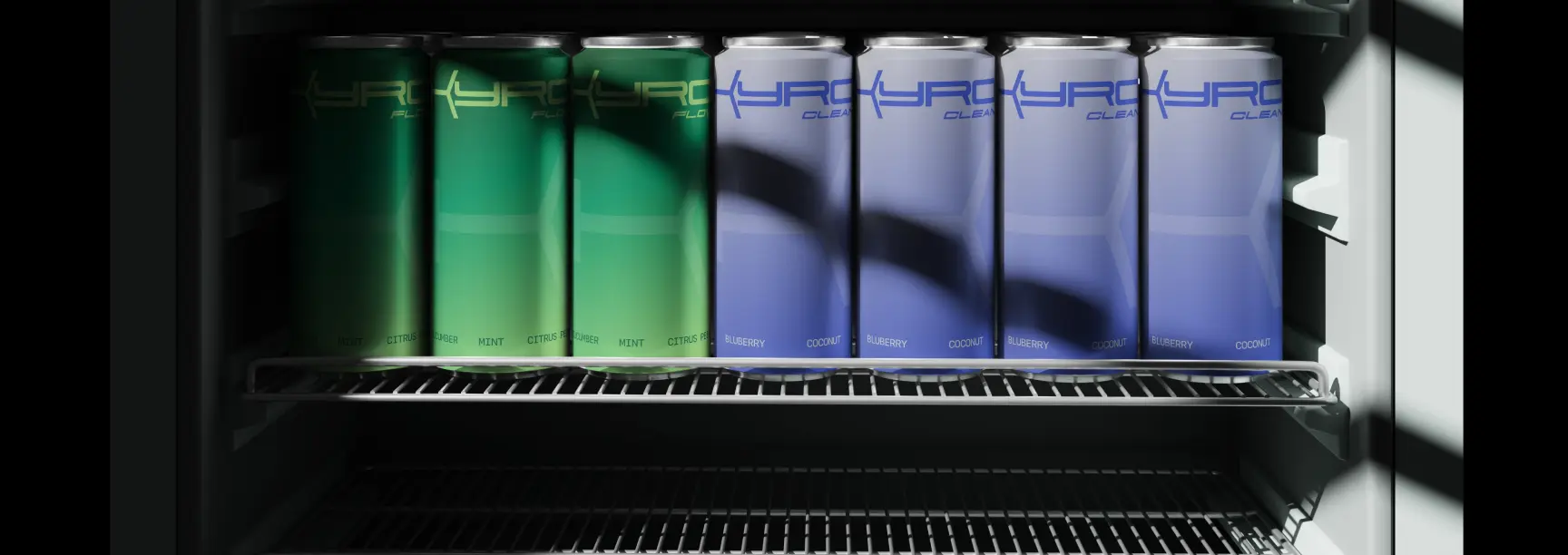
A new category between lifestyle drinks and performance supplements.
KYRO becomes more than a beverage; it works as a tool for modern performance. Functional formulation and a restrained, premium identity carry the same message: clarity, purpose and nothing added for show.
The brand communicates clearly and stands out without noise. Because it is built as a system of states, it scales naturally into new products, formats and markets. Built not just to hydrate, but to elevate.

Building something like KYRO Hydration?
Tell us what you're building and we'll come back with a clear scope, a timeline and the right team for it.
Prefer to talk? WhatsApp +971 50 262 0941